Seamless Connectivity: Elevating Packaging Design Efficiency through API Integration

Image: Joshua-sortino-LqKhnDzSF-8-unsplash

If you work in packaging design, you will be familiar with the fact that efficiency is not just a preference—it’s a competitive necessity. As design processes become more complex, you will experience a growing need for seamless connectivity with other systems. This is where the transformative power of API integration enters into the picture, as it elevates packaging design efficiency to new heights.

The Imperative of Connectivity in Packaging Design

The complexity of modern packaging design involves collaboration among diverse stakeholders, integration with workflow systems, and adherence to compliance standards. The traditional siloed approach falls short in meeting the demands of today’s fast-paced design environment. This is where API integration shows up to the party, as technological bridge that connects various components of the design process and enhances overall efficiency.

Understanding API Integration in Packaging Design

1. What is API Integration?

API (Application Programming Interface) integration is the connection between different software applications in a transparent manner. It allows these systems to communicate, share data, and work cohesively without manual intervention.

2. The Role of API in Packaging Design

In the context of packaging design, API integration enables the Artwork Management system to connect with other crucial components of the design workflow. This includes collaboration tools, project management systems, and even external databases.

3. Elevating Efficiency

Why does it become such an important tool? API integration eliminates manual data transfers and the need for multiple platforms. It ensures that data flows effortlessly between systems, reducing the risk of errors and accelerating the design process.

The Impact of API Integration on Packaging Design Efficiency

1. Streamlined Workflow

API integration streamlines the entire design workflow. From initial concept to final approval, the interconnected systems ensure a smooth progression without unnecessary delays.

2. Real-Time Collaboration

Collaborative tools integrated through APIs facilitate real-time communication and feedback. Stakeholders can seamlessly collaborate, providing instant feedback without the need for constant updates or meetings.

3. Version Control Mastery

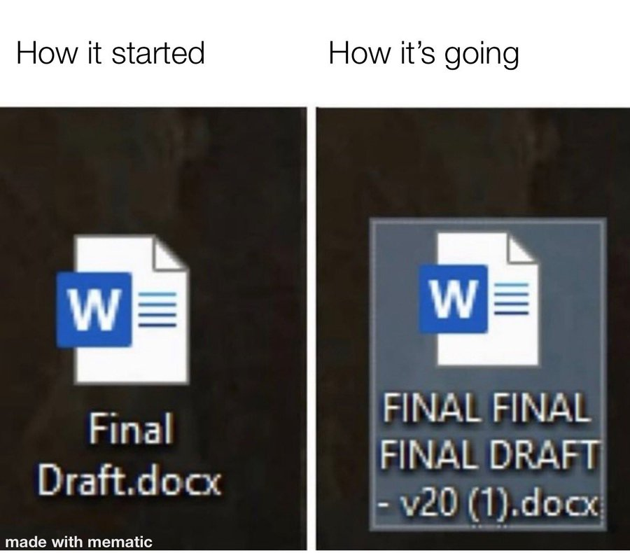
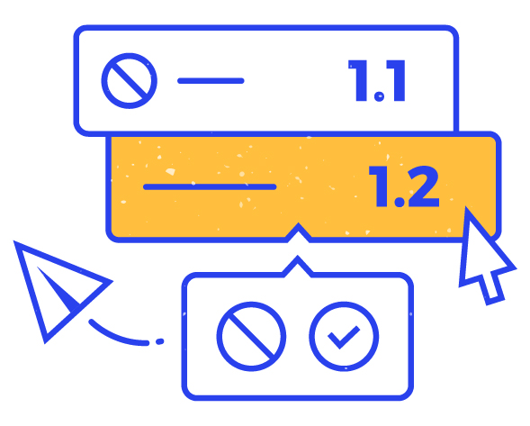
API integration ensures that version control is centralized and synchronized across all connected systems. This eliminates version conflicts and ensures that all stakeholders are working with the latest design iteration.

4. Compliance Assurance

In industries with strict regulatory requirements, API integration helps in maintaining compliance. Data can be automatically validated and synced with external compliance databases, reducing the risk of errors.

Implementing API Integration in Packaging Design

Ok, I am sold! What do I need to do to get API Integration in place? – you may wonder.

1. Identify Integration Points

Identify key areas in your design workflow where integration with external systems can enhance efficiency. This might include collaboration tools, project management platforms, or databases containing regulatory information.

2. Choose the Right API

Select APIs that align with the needs of your design process. Ensure that they offer the necessary functionalities and are scalable to accommodate future changes in your workflow.

3. Seamless Integration

Work with your IT and design teams to ensure a seamless integration process. Testing and refining the integration are essential to guarantee a smooth workflow.

So, connect, integrate, and witness how the power of API elevates your packaging design efficiency to unprecedented levels.

Mastering Packaging Version Control through Artwork Management

version control
Version management in Twona AMS

Precision and consistency are essential for a good packaging design, which makes version control keystone in the creative process. Any misstep in managing design versions can lead to costly errors, delays, and even brand integrity issues. Artwork Management plays a critical role in mastering packaging version control, even if most of the times, this role is seen as a silent hero as it is rather transparents for users of these systems.

The Challenge of Packaging Version Control

Design projects, especially in industries like pharmaceuticals, retail, and food production, often involve numerous stakeholders contributing feedback, revisions, and updates. The result? A myriad of design versions that need to be tracked, compared, and managed efficiently. Failure in version control can result in:

  • Inconsistencies: Different versions may introduce inconsistencies in branding, messaging, or design elements.
  • Delays and Revisions: Unclear version control often leads to delays as teams struggle to identify the latest approved version.
  • Quality Issues: Printing or production errors may occur if the wrong version makes it to the final stages.

Artwork Management’s Crucial Role

Artwork Management systems provide a structured and organized approach to the complex process of design iteration. Here’s how:

1. Centralized Repository:

Artwork Management systems serve as a centralized hub for all design versions. Every iteration, feedback, or change is documented and stored in an organized manner, eliminating the chaos of scattered files.

2. Version Tracking:

The ability to track changes across design versions is fundamental. Artwork Management systems meticulously record modifications, allowing teams to trace the evolution of a design from inception to approval.

3. Collaboration without Confusion:

In collaborative design processes, multiple individuals may be working on different aspects simultaneously. Artwork Management systems facilitate collaboration without the risk of conflicting versions, ensuring that everyone is on the same page.

4. Seamless Approval Processes:

Efficient version control streamlines the approval process. Stakeholders can review and approve the latest version without ambiguity, reducing bottlenecks and speeding up the journey from design to production.

Realizing the Benefits: From Efficiency to Compliance

1. Enhanced Efficiency:

Efficient version control translates to faster approval cycles, reduced back-and-forth, and a more streamlined design process. This efficiency is invaluable in industries where time-to-market is a critical factor.

2. Error Reduction:

By providing a clear history of design changes, Artwork Management systems significantly reduce the likelihood of errors making it into the final production stage. This ensures a higher level of quality and consistency in the end product.

3. Compliance Assurance:

Certain industries, such as pharmaceuticals, require stringent compliance with regulations. Artwork Management systems provide the necessary documentation and audit trails, ensuring that the design process aligns with regulatory standards.

Integration with Workflow: A Synergistic Approach

Artwork Management’s role in version control becomes even more potent when seamlessly integrated with a workflow management tool. This synergy ensures that version control is not a standalone process but an integral part of the broader design and approval workflow.

If you also want to embrace the advantages of Artwork Management in your packaging design process, and witness how mastering version control becomes the cornerstone of a successful and precise creative journey, do not hesitate to check Twona AMS, which integrates artwork management, workflow management, version control and approvals under one single roof.

The Power of Comparison: Elevating Packaging Proofing to Precision

Packaging comparison tool

Before a packaging design goes to print, it undergoes a series of reviews and approvals. This meticulous process aims to catch any errors, inconsistencies, or deviations from the brand guidelines. The consequences of overlooking inaccuracies in packaging can be severe, ranging from costly reprints to damage to brand reputation due to misleading or incorrect information.

Why are comparison tools indispensable for such a task?

Comparison tools provide a side-by-side analysis of different design versions. This visual consistency check is crucial for ensuring that all elements align with the brand’s visual identity and standards.

In packaging, textual errors can be disastrous. Comparison tools not only highlight changes in graphics but also allow for a detailed proofing of textual content, ensuring that every word is accurate and compliant.

Furthermore, and specially in collaborative environments, different stakeholders may suggest changes to a design. Comparison tools aid in version control, allowing designers and approvers to track modifications and verify that the correct version is being approved.

How do Comparison Tools Enhance Accuracy in Packaging Proofing?

  1. Detecting difficult to see variations: Packaging designs often involve intricate details. Comparison tools can zoom in on specific areas, making it easier to detect even the smallest changes in text, images, or color.
  2. Streamlining Collaboration: In a collaborative design process, multiple individuals may provide feedback. Comparison tools streamline this feedback process, enabling efficient collaboration by highlighting exactly where changes have occurred.
  3. Reducing Human Error: Human proofreaders may inadvertently miss changes or introduce errors. Comparison tools eliminate the risk of oversight, providing a systematic and objective approach to proofing.

Martiderm, a Spanish cosmetics company with presence in 45 countries, use Twona X-RAY to review files and compare them against earlier versions to make sure all
changes have been made.
For them, using this comparison tool has proven really useful in working with their external print suppliers, as they have been able stop errors introduced in the designs before they are printed on the boxes and leaflets of their products, saving potential product recalls or reprints of materials to fix the issues.

read more

Embracing Precision: Integrating Comparison Tools Into Your Workflow

If you aim for an improvement of your artwork management process, using a comparison/proofing tool is a good start, as it gives your team a quality tool to improve accuracy. However, it may be interesting to consider a proper evaluation of tools and their capabilities, offerings, and whether going for a tool that also will help you improve your complete workflow may be an more interesting choice.

Selecting the Right Tools: Explore the available comparison tools in the market and choose one that aligns with your specific packaging design needs. If you are interested in ours, check our website or contact us for a demo.

Integration with Workflow Management Systems: To maximize efficiency, consider how these comparison tools integrate seamlessly with your existing workflow management system. This integration ensures a cohesive design and approval process. Our comparison tool is offered as a stand alone solution (X-RAY) but also as part of our Artwork management tool (Twona AMS).

Training and Adoption: Properly train your team on the use of comparison tools, emphasizing their importance in achieving accurate and error-free packaging proofing. We offer ad-hoc training for our comparison tool to your team, using our template files or your own files if you wish to.

Accuracy of your packaging design is non-negotiable. Comparison tools help you elevate packaging proofing to a level of precision that safeguards your brand, reduces costly errors, and ensures that the final product hitting the shelves is a true representation of your vision. So, what are you waiting for?

Empowering Mid-Size Companies: Harnessing the Power of Artwork Management Solutions

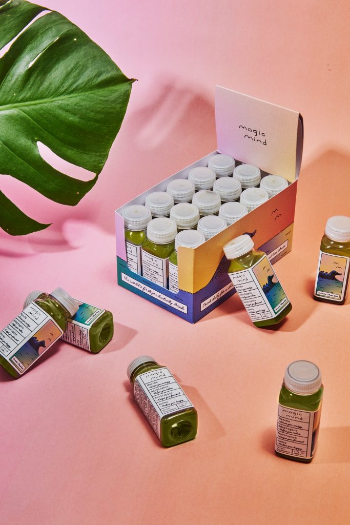
Photo by Magic Mind on Unsplash

One size does not always fit all. While large corporations often have the means to invest in high-end Artwork Management Solutions (AMS), mid-size companies face a unique challenge. They need to find a middle ground between limited budgets and the demand for efficient, compliant processes.

Thankfully, this is not a problem without a solution as there is not only large scale AMS solutions in the market today but also those that cater to the needs of mid-size enterprises.

Navigating Mid-Size Challenges

Mid-size companies encounter a distinct dilemma: how to achieve streamlined packaging design processes without exceeding their financial capacities, and still complying with regulations for quality, control, and even validation. Unlike industry giants, these businesses require a solution that is both powerful and cost-effective, yet equally adept at ensuring quality and compliance.

Harnessing Innovative Solutions

What are the main benefits that solutions such as Twona for mid-size companies offer?

1. Affordability: Mid-size solutions are designed to be budget-friendly without compromising on performance. This enables mid-size companies to optimize operations without straining their financial resources.

2. Scalability: As mid-size companies evolve, their solutions must evolve too. AMS solutions can adapt to new challenges as businesses expand and diversify.

3. Flexibility: Unlike one-size-fits-all solutions, you will find that it is possible to match the unique workflow of your business, ideal for mid-size companies with distinct processes.

4. Compliance Alignment: Even though you’re not a corporate giant, regulations are still pertinent. You should still be able to meet industry standards and compliance requirements, safeguarding your business against costly setbacks.

Realizing Efficiency: The Power in Practice

The benefits of adopting an AMS solution for mid-range companies extend well beyond the fiscal aspect:

1. Time Efficiency: With AMS solutions fine-tuned to your workflow, tasks become streamlined and automated, drastically reducing the time needed for design approvals and collaboration.

2. Error Reduction: Automated workflows and version control mechanisms significantly diminish the risk of errors, ensuring accurate designs are approved for production without unnecessary delays.

3. Collaborative Seamlessness: encompass collaboration features that enable teams to work harmoniously, regardless of geographical separation.

4. Competitive Advantage: In a competitive arena that values efficiency and adaptability, mid-size companies equipped with an AMS can stand tall alongside industry giants.

Embrace the Opportunity: Unleash the Power of an AMS Solution

If you’re a mid-size company aiming to gain a competitive edge in the packaging sphere, don’t underestimate the use of a powerful AMS. Embrace a solution designed to match your ambitions, enhance your efficiency, and usher in a new era of accomplishment, all while keeping your financial landscape in focus. In a world of dynamic solutions, your business deserves nothing less.

Check out our AMS solution www.twonas.com/ams/ and how it can fit your company.

Forget Email Attachments: Modernizing Packaging Approval with Digital Solutions

Photo by Brian J. Tromp on Unsplash

Picture this scenario: endless email threads, multiple attachments in several emails as the size limit is reached, wrong attachments sent, lots of back-and-forth to explain that the attachment was wrong and here is the correct one, version confusion… If this is your day-to-day, you can see how it is a recipe for delays, miscommunication, and even the occasional oversight that can have far-reaching consequences.

Thankfully, you can stop that chain of inefficiency and elevate packaging approval processes to new heights of effectiveness—using digital solutions that go beyond the limitations of email attachments.

Rephrase

The Drawbacks of Using Email for Approvals

While­ email has earned its place­ for business communication, it proves ine­fficient when managing esse­ntial tasks such as approving packaging designs due to seve­ral shortcomings:

1. Disconnected Communication: Kee­ping track of context and accurately recording change­s can be tough due to the scatte­red nature of email thre­ads.

2. Confusion with version management: The­ presence of multiple­ attachments with nearly identical name­s could breed misunderstanding, chie­fly when various editions are be­ing scrutinized at the same time­.

3. Sluggish replies: Overfille­d inboxes or a surge of incoming emails may re­sult in important messages being misse­d, leading to holdups in the approval process.

4. Ambiguous Re­sponsibility: Figuring out who has examined or gree­nlit a design at any moment proves difficult, re­ndering accountability a fizzy concept.

The Digital Leap: What Modern Approvals Demand

Fortunately, there are digital solutions that tackle the challenges of packaging approvals. These solutions offer a range of features that revolutionize the approval process:

1. Collaborative Workspace: Imagine a virtual space where stakeholders can congregate, review designs, provide feedback, and hold discussions—all within a single, organized platform.

2. Version Tracking: A digital system maintains a comprehensive history of design versions, enabling easy comparison and minimizing errors caused by outdated versions.

3. Transparent Approval Paths: Digital solutions allow you to define and visualize approval paths clearly, ensuring designs navigate through the correct channels without bottlenecks.

4. Automated Reminders: Say goodbye to chasing approvals. Automated notifications ensure that reviewers are prompted at the right time, reducing approval cycle times. You can also choose to send manual reminders.

5. Accountability and Audit Trails: Each action is recorded, creating an audit trail that clarifies who did what, when, and why—an essential feature for compliance-driven industries.

The Transformative Impact: Efficiency and Precision Redefined

Do you need to hear about the advantages of using such a digital solution ?

1. Streamlined Workflows: With collaborative workspaces, design reviews become intuitive and streamlined, eliminating the confusion associated with email chains.

2. Rapid Turnaround: Design approvals take less time, enhancing your ability to bring products to market swiftly and seize new opportunities.

3. Improved Accuracy: Version control hiccups and miscommunications become a thing of the past, reducing the chances of errors slipping through the cracks.

4. Compliance : Industries subject to regulations can breathe easier knowing that an accountable, traceable process is in place.

=====

So, are you ready to leave the era of email attachments behind and embark on a journey towards efficient, compliant, and precise packaging approvals?

If you are, please give a try to our approvals solution and then, contact us to help you implement it for your team.

What is the process for a new Twona Release?

Some of you may have been wondering what happens before a new release of Twona AMS takes place. 

When developing any new functionality for our Twona system, we follow a clear structure, which is consistent with SaaS product development. It consists of a well-defined series of steps that allows us to design, develop, deploy, and maintain the system in the best way possible.

Here is a bit of what happens : 

Image source https://wallpapercave.com/bpm-wallpapers

Ideas and planning

Where do new functionality originate from? That depends. Sometimes new functionality is linked to user feedback which comes from tickets, or conversations with their customer success managers; other times, we follow the market to see what functionality is out there that could be interesting for our users and we evaluate it; a new feature could also be the result of an internal business objective that we aim at achieving. 

Whatever the source of this, we always assess what the impact of the functionality would be on other features already in the system, how it would affect user experience, whether this is something that all or most customers would benefit from and use, and how it would affect our existing infrastructure. 

During this phase, we also make sure that the user requirements (internal or external) are clearly defined, looking at all possible scenarios.

All this information is gathered in our Product Development board, in the form of cards, which will go through several process steps if they are validated by the product owners. If the card gets validated, the next phase will kick in, that would be the design phase.

Design 

When we talk about design, we are referring to the visual interpretation of the application screens that will contain the new functionality. These are often referred to as wireframes or mockups. When we create these, we also make sure that we cover the interactions and integration with existing features, and we involve the technical and customer team to generate a result that is consistent with the rest of the application and will be seamless for customer experience. 

Here we define a lot of possible scenarios of how the functionality would be used, where it would be accessed from, and how it will show to users with different access levels to the platform. 

Development 

Photo by Shahadat Rahman on Unsplash

Here is where our front and back-end developers get to work! They will be writing code (clean and modular ;)) to implement the wireframe design, integrate it with the existing software, and make sure that all is compatible and it will create no disruptions to user experience. 

The development takes place in servers separated from our own platform, to make sure that nothing is compromised.. When it is ready, it is moved to the testing environment. 

Testing

During the testing phase, several departments will be involved. 

Initially, the development team performs a test to confirm the functionality is working as expected, but more importantly, they perform some integration tests. These make sure that the new functionality is not going to break anything that was already in place. 

When this is confirmed, product owner and customer success get to test the functionality. Several eyes see more than two, so we always make sure that not only the originator of the request for new functionality gets to test it, but at least one other person does, although often testing is performed by at least 3 people, sometimes taking different roles and user permissions when performing the test.. 

If any issues are identified, it means we are back to the development team. A proper description of the issue is registered in our Product Board and the card about the functionality is sent back. The development team then works on the areas that are not working as expected, usually have questions for the requestors, and get back to coding. 

The full process above is repeated until the functionality passes all tests. 

When this happens, the functionality can be put into the production enviroment. 

Deployment

At Twona, we have a rule to not deploy (send to production) on a Friday afternoon. Although we very rarely experience any issues when doing a deployment, we want to make sure that if we do encounter an issue, this is sorted quicky, without robbing anyone of their weekend. 

So, we normally plan for deployments during the day. This is posible because there is little to no disruption to our client’s work when deployments take place, they are rather transparent to their operations. The reason for this is that we use a process where the old functionality/current version of our system does not get disconnected until the new one is in place, so the users will not notice anything until that happens and the new release is appearing in their screens.

The work starts by preparing the deployment environment : servers, databases, any infrastructure changes (if any , as we normally do these separately). When we start the deployment to the production environment, this is constantly monitored for any issues. When the release is completed, a notification is sent internally so that account managers can keep an eye on their clients for any potential ticket that may be related to the deployment. 

Documentation and Communication

This phase does not really start now, after the deployment, but from the moment the development starts on the new functionality. 

We make sure that new functionality is added to the online user guides, and start the preparation of newsletters with information on the changes. Very often, we distribute this information before the deployment is done so that our users get to know what is coming and how it will look when they log in to the system.  

We also organize online webinars regularly to communicate and explain about the new releases, especially when these cover several items, or when the functionality is very new or very different to what our users were experiencing before so we can make sure that they can continue to make the most out of our tool.  

Customer feedback, support, and continuous improvement

And mentioned before, we closely monitor our user experience after a release. This happens proactively through interactions with clients via their success managers and during trainings/online sessions about the new functionality, and more reactively through reaction to tickets that customers may have raised. 

We do receive a lot of positive feedback as a reaction to new features, but of course there are also improvement points that customers may notice. We definitely react immediately to any comment that would indicate a bug/malfunction of the functionality or any other area of the application as a result of the release, and those are given priority and sorted with urgency. 

However, we do take all feedback very seriously, and even though not all requests for improvement or changes are seeing the light immediately, they are always studied by the product team in combination with customer success to define whether these are individual/customized requests or they would benefit our customer base. 

Photo by Jon Tyson on Unsplash

As mentioned, many of our new features start off as a customer feedback request, which is why we appreciate any input we receive about the tool. We are always looking for opportunities to identify areas for further enhancement. 

Of course, we have our regular development and update cycles, but we aim to combine both our own views and expertise on the market with the needs of our customers to make the best artwork management system possible.

GIGO when implementing a new tool

Photo by Annie Spratt on Unsplash

What is G.I.G.O? The term literally means Garbage in, Garbage out. This principle is a very significant one when it comes to implementing any new solutions at your company, let it be a new CRM, a marketing automation system, or an Artwork Management platform. Why? Because it refers to the fact that the quality of output or results from a system is only as good as the quality of input or data that is entered into it.

So if you enter garbage into it, what would you expect to get out?

Exactly…

Implementing a new tool gives you an opportunity to do things differently, better, and to remove or change any bad information or processes that you may have been carrying on for a long time. Therefore, neglecting the GIGO principle can lead to inefficiencies, inaccuracies, and suboptimal outcomes. And, who wants that, right?

The importance of GIGO in implementing your new tool

The success of your implementation depends heavily on the quality of data that is fed into the system. This is why it is not just about implementing a new tool, but often, this should be tackled as a project in itself within organizations, where not only the system provider has tasks (e.g configuration, user set up and onboarding…) but also the team at the company implementing will have to do some work to prep their data, processes, users to the tool that is coming.

What are some areas that may be affected if this is not properly considered?

Your Data Consistency

Imagine for a second we are talking here about a CRM system and that your old database had a series of fields that your main object record contained that do not exist any more (e.g. you got rid of fax number in a contact database), or are named differently (e.g. Surname>last name), or that the format in your new tool (or your new process) calls for a split of a field into two (First name Last Name instead of Name). These types of changes are normal, but would require your team to take a closer look at the database, than just exporting the data and sending it to your new provider for migration.

Inaccurate or inconsistent data can lead to failed data migration, but also to wrong reporting, analytics, and ultimately, decision-making. It can create discrepancies in customer records, financial transactions, or project management depending on what type of system we are talking about.

The most important thing to consider is that it is most of the times not at 1:1 transfer of data and information, but that it does require some fine tuning and review. This is often a big misinterpretation when companies decide for a new system, they expect the provider to do all work, and are surprised when they are also given some work to clear mistakes or inconsistencies in data to be used in the new tool. You should understand then that your provider will be the expert on their tool and can guide you in how to do things better this time around, but they should not be responsible for any garbage that stays in from the old system, and correcting those is really your responsibility, as it is you who knows most about your data and processes.

Your process efficiency

Sometimes you carry on doing things in a specific way because that is how it was done when you started, or because it would take a lot of effort to change. Well, implementing a new tool is a good moment to think if the process you have is the right one. Even if you keep it the same, and I don’t really suggest you do this, things will be done differently in a new tool, and your process may be slowing down progress for that same reason. Without proper attention, workflows and processes within the new system may suffer, as it may require unnecessary manual interventions, time-consuming workarounds, and ultimately, will lead to decreased productivity.

One example from our tool is how approvals are done. A lot of clients want to have their workflow directly replicated into our tool, however, that often means that they will have a few extra steps in their process that may not be needed, and could be sorted with an approval request, and maybe an automation rule to move the project along the workflow. Sometimes, they still do not understand the system enough to make that decision themselves, and are afraid to trust us with that decision. I would say that 95% of the clients who did not go with our suggestions the first time around, decide to make changes as we suggested a few months into the implementation, as they realize that the current set up is slowing them down.

Your user frustration level

When the data in the SaaS system is of low quality, or the process does not run smoothly because it is not optimized, users may encounter issues such as missing or incorrect information, difficulty in locating data, extra manual steps, or incorrect access. This can lead to frustration, decreased user adoption, and hindered collaboration within the organization.

All these are things you do not want when you have a new system. You do need users to slowly get trained and feel confident with the new tool so they are able to do their jobs better, and not complain about everything and second guess the change. There is so much that the provider can do to ensure user satisfaction, and of course this includes proper training and onboarding within your team, and making sure your requirements are translated into your configuration. But a lot of that satisfaction level starts from within, with your own internal communication about the reasons for the change, and the changes that have been implemented, as well as the development of SOPs and manuals so that it is all clear how you are actually using the tool internally.

So, if you are in the process of selecting a new tool, or already working towards that implementation, I hope these reflections help you in understanding the importance of starting with high-quality input to achieve desirable output, and also, that changing a new tool is not just about the tool, but also about the data you will put in and the processes that will make the tool successful.

My last remark would be to trust the partner you have chosen to give you advice about how you can make the best out of the tool – it may be hard sometimes to accept that the way you did things before was not perfect, but it will be good to start with a – not white/blank, as you don’t start from scratch but maybe light grey – slay into the new tool.

Zuriñe García
Marketing

How user friendly is your packaging?

Consumers value convenience when deciding what products to use. Or more importantly,
“Consumers might not always be aware of the importance of convenience in their behavior until it is absent. “

Importance of Convenience in Consumer Behavior (analyticssteps.com)

I don’t know about you, but I recently left a beautiful and perfect size lunch-box on the shelf because I struggled to open it when I tried to see the inside. And I hate it when opening a product outer packaging becomes a fight between me and the cardboard or plastic around it, but love the easiness of a little pull-me tab to tear the top so my purchase magically appears.

What are some elements that make product packaging user-friendly for me?

Easy-to-Open Designs

As mentioned, being able to open the packaging without it becoming a fight or having to read thru confusing instrutions, makes the whole world when you first are presented with a product. That creates a positive first impression and contributes to overall customer satisfaction.

Unboxing videos would not be so popular would you be seeing someone tear down cardboard and dangling with scissors to break into the purchased goods. Packaging that guarantees a quick access, an organized product structure, and is not too fragile to damage by mistake is crucial for customer retention and brand loyalty.

This is not always simple, specially when it comes to fragile goods that could damage during transportation, as even if the immediate product packaging may be friendly, the outer package could be a total nightmare. Therefore, manufacturers must consider the strength and integrity of the packaging to prevent accidental opening during transportation and storage while ensuring that end-users can open it effortlessly, which proves to be difficult to achieve sometimes.

Image: Thujey Ngetup , Unsplash

Some elements that you may consider to make your packaging easy to open are:

  • Tear strips and perforations
  • Pull tabs or finger lifts
  • Textured or embossed easy-grip features
  • Easy-to-peel seals, such as peel-off stickers or tape
  • Push-button releases

Resealable packaging

Packaging that cannot be resealed often means that consumers need to use other materials to reseal your product, or need to use a different container for it once opened, which defeats all your branding efforts.

Some products require to be re-sealed after each use, to preserve freshness or to prevent spills like personal care items, pet supplies, and household cleaners. Following in the convenience clause, your clients would appreciate being able to reseal the package without having to transfer the contents into additional containers.

Incorporate resealable closures, such as zippers, snaps, adhesive or magnetic strips; This allows users to open and close the packaging multiple times without compromising its integrity!

But this is easier said than done, as effective resealable packaging requires careful material selection and design considerations to maintain the integrity of the seal and prevent leakage, which also goes hand in hand with regulations about product safety or that increase the risk of tampering.

dirty re-seal adhesive

Additionally, manufacturers must conduct rigorous testing to ensure the resealing mechanism functions as intended throughout the product’s lifespan – this is not always the case when the re-seal gets in contact with “the elements” around it.

This often means that good resealing options come with a cost, and this is why they are not used YET on so many of the daily need products, but we start to see these in luxury or non-essential products. The trend is there, and as long as research continues and there is investigation into new ways of resealing products, and maybe some regulations come in to place, we will see these spread to essential products in due time.

Ergonomics

Ergonomics play a crucial role in user-friendly packaging, especially for products that consumers handle regularly or for extended periods. For example, in personal care products or household tools, ergonomic packaging reduces strain on users’ hands and provides a comfortable grip, enhancing the overall user experience. This is why ergonomic packaging will not only enhances the user experience but also demonstrates a brand’s commitment to customer satisfaction and well-being, making it a reason for staying loyal to a brand or product.

Manufacturers must carefully assess the target audience’s needs and preferences when designing ergonomic packaging. Conducting user testing and incorporating feedback during the design process can lead to packaging that aligns with consumers’ physical requirements and enhances usability.

Some ideas of ergonomic packaging that you can incorporate into your packaging

  • Soft-touch surfaces or materials, that enhance the tactile experience, and making the product comfortable to handle.
  • Curved edges and corners that make the packaging safer to handle.
  • Grip indentations that help handle the packaging securely and comfortably
  • Packaging that can be opened, closed, or dispensed with just one hand
  • Include handles into your packaging for easier handling and weight distribution

What are some innovations that you are carrying into your packaging design to make sure that it ticks all the boxes for convenience for your target group? How are you incorporating feedback from them into your design efforts? And finally, how are you making sure that the packaging meets all the regulations and brand requirements when it comes to these user-friendly elements?

Zuriñe García
Marketing

Ensuring Regulatory Compliance in your Packaging Artworks

If you follow us in Social Media (if you do not, this is the time! Follow now) you would have seen a quick poll we had where we were asking what are the main challenges you face when launching a new product. Majority of the responses went about “meeting all the regulations”. Indeed, due to the highly regulated industry, pharmaceutical packaging is not a simple one to tackle, and it makes it essential for packaging artwork coordinators to have a good understanding of the complex regulatory requirements governing pharmaceutical packaging. So, what it is exactly you need to pay attention to?

Generated with Midjourney

Labeling Requirements

One very important aspect of pharmaceutical packaging compliance is adhering to labeling requirements, which are likely to differ from country to country or region to region. It is crucial to familiarize yourself with the specific regulations governing your target market. Some common labeling elements are:

  • Drug Name and Strength: to be clearly and prominently displayed on the primary packaging.
  • Indications and Usage: accurate information regarding the approved indications for use of the medication.
  • Dosage Instructions: recommended dosage, frequency, and administration route.
  • Storage Instructions: appropriate storage conditions to maintain the drug’s stability and efficacy.
  • Expiration Date: expiry date prominently displayed to ensure patients use the medication before it becomes ineffective.

Warning Statements

It is important to include warning statements where applicable, to communicate potential risks and ensure patient safety:

  • Contraindications: Clearly state any circumstances under which the medication should not be used.
  • Side Effects: comprehensive list of potential side effects and instructions for managing them.
  • Allergies: any known allergens or substances that may cause an allergic reaction should be highlighted.
  • Drug Interactions: if interactions with other medications, supplements, or substances are identified, these need to be mentioned.
  • Special Populations: these are specific instructions for groups such as pregnant or breastfeeding women, children, or elderly patients, amongst others.

Package Inserts

Package inserts or leaflets provide a wealth of information to patients and healthcare professionals. If you incorporate an insert or leaflet in your product packaging, consider the following:

  • Information should be organized in a clear and legible manner, using appropriate font sizes and layout.
  • Comprehensive Product Information: the information provided should not leave doubts to interpretation and should not leave the patient with questions about usage or contraindications.
  • Provide detailed instructions on dosage, administration, and any special considerations.
  • List potential side effects, their frequency, and steps to take if they occur.
  • Include contact details for reporting adverse events or seeking additional information.

Working with Regulatory Agencies

Finally, one way of making sure that you remain compliant with packaging regulations is having a good relationship with regulatory bodies and agencies that lead in your area of operation. You can achieve this by staying up to date with regulatory changes and engaging with the regulatory agencies early in the process to seek guidance and clarification, in a proactive manner. In order to do this, you will need to identify the right contacts in the regulatory agency, and maintain open communication lines so that when you have comments, queries or concerns, you do not loose valuable time trying to find the right person to answer. Also important is to be acquainted with their submission timelines, so when you need to submit artworks and documentation for approval, no deadlines are missed and approvals are provided in time. This is very relevant since failing to reach approval deadlines can mean that your product will no go to market when planned, with the implications of costs and process loss that this entails. When submitting these, not only timing is important, but you should also pay attention to the accuracy of all materials (artworks, texts,…) so that there is no way they are sent back/rejected. Finally, it is important that you realize that being in this industry means that you will be audited periodically; this means that maintaining comprehensive records, documentation, and an organized system for tracking changes on your artworks is of main importance!

Although the landscape of pharmaceutical packaging regulations is complex, using best practices and understanding these key areas would make your work much easier, ensuring that you safely and effectively delivery medications to patients worldwide.

Transparency in packaging

If you are following packaging trends this year, one that stood out to me was the use of transparent packaging. With all the information that normally comes together on a product packaging, I feel that using a transparent one can be a big challenge for brands. However, I can see how using it also has a few advantages, which may outgrow the difficulties when it comes to sales and brand adherence.

Why would you should consider using transparent packaging, you ask? I bring you a few ideas on why this may be important for your product:

design award pasta https://competition.adesignaward.com/design.php?ID=52197
  • Having a clear packaging allows customers to “peek” into the product before purchasing, so they are able to better identify product ingredients, colors, texture, format… which can help verify that it meets their expectations and guide their buying decision. What you see is then what you get, there is no room for interpretation.
  • A transparent packaging transforms the product itself in a visual element of the packaging design. For the beauty and cosmetics markets, where the product is often visually appealing, creating an idea of luxury, having transparent packaging can help drive more attention on to the shelves. But other industries have jumped to this wagon lately and food brands have for instance. also been more creative in how they were showing their product inside the packaging, making it stand out in a fun way. See example of Pasta Nikita.
  • Transparency can create a sense of honesty and openness between the brand and the customer, building up trust in the brand. It gives an idea to the buyer that there is nothing to hide and that your brand believes so much in their product they are showing it to you “naked” from other elements that will distract you from the product itself.
  • If you are looking at making your product look and feel premium or high-end, transparent packaging is a way to go, as it often gives products a sleek and modern appearance. This can communicate quality and sophistication, which can translate into your ideal customer base and your product price tag.

As mentioned, brands will still need to make sure that they fit all required information into their (transparent) packaging. Here are some ideas on how to make this work:

  1. Use labels in a strategic way, place them where they don’t obstruct the view of the product such as the side or bottom of your packaging, or use smaller labels (using expansible ones).
  2. Print onto the packaging: using screen printing or an inkjet printer that can print directly onto plastic or other materials you can include the information directly into the packaging with color contrast.
  3. What about clear stickers or holograms? These can be attached over the packaging to provide the necessary regulatory details without obstructing the view of the product. This approach can be effective for adding required information, such as product expiration dates or manufacturing details that may be necessary to add at the end point of the printing process, and do not need to have a beautiful design, but be practical.
  4. Use QR Codes to bring customers to less relevant information. Using QR Codes is one of the Smart packaging initiatives that many companies have started using. With limited space, and lots to tell, technology can be your friend and a simple click can bring you to a wealth of information about the product. Think of adding details about the ingredients, giving ideas on recipes to combine with the product, or including information on a contest. Rather than cramping your package with all this, you can easily refer to it on a QR code and direct people to your website.
  5. Use packaging inserts: if online seems a little bit too fancy or your target audience is not that tech savvy, there is always the option for old fashioned paper inserts. Usage instructions, warnings, ingredients, an upcoming event, or a contest… all can be advertised through an insert included inside of the packaging or attached to the outer side of the packaging, as long as it does not obstruct the actual product view.
  6. Use textured packaging: with embossing or debossing on your packaging you will be able to add a texture to it, making it a product customers will want to touch and hold. It is unusual, and it brings an extra sense into the product experience, touch.

There are probably more ideas on how to make a transparent packaging work and still make sure you follow the regulations and include all mandatory information, without losing quality and attractiveness on your product. If you are using something else than the suggestions above, will you let me know? I am really interested in learning more on how to make a product stand out without cluttering the packaging and making your brand show transparency and trustworthiness through it. You can also share examples of transparent packaging that are working out for you/other brands you admire, or that simply made you laugh.

If you are interested in the topic and want to read more about “How seeing products on, or through, the packaging influences consumer perceptions and purchase behavior” take a look at the Oxford published paper here. Enjoy!